The client
Stotles is the UK leading platform for finding and managing public sector bidding opportunities. Stotles enables organisations to handle, organise and action public sector sales on a centralised platform. Managers can monitor the activities of buyers and partners, track contract expirations, create a personalised feed of relevant public sector opportunities and streamline communication with key stakeholders.
The task
I was in charge of creating the full identity of the brand - including logo, colour palette, typography rules, graphic toolkit, infographics, illustration style and website design.
Stotles
branding
Industry: Software Development, B2B
Design area: Branding identity, lllustration, Digital design
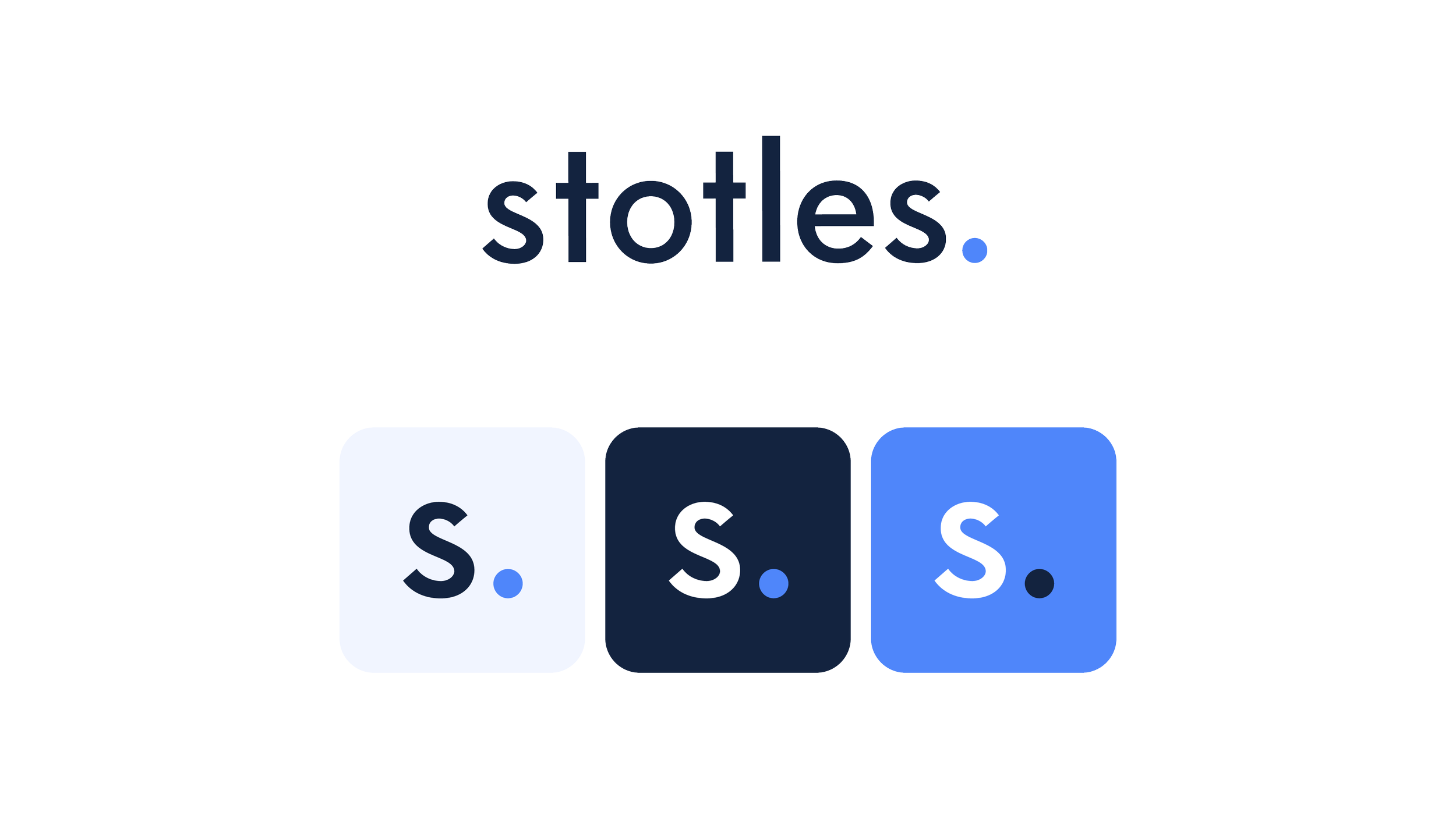
The Stotles logo features a clean and modern design, utilising a linear typeface to convey a sense of sophistication and professionalism. The typography is straightforward, with clean and evenly spaced characters, reflecting the startup's commitment to simplicity and efficiency in its tech-based solutions. The logo consists of the startup's name with the addition of a full stop. The full stop is used as a design element to add a sense of completion or closure to the logo. It provides a visual break and creates a distinct and memorable visual feature.
1. Logo
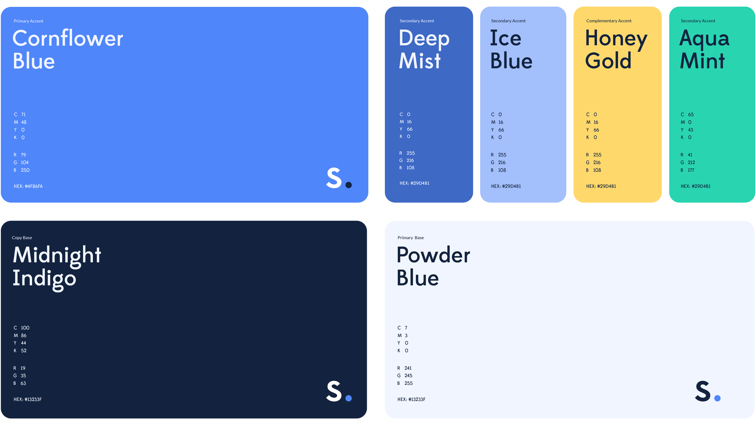
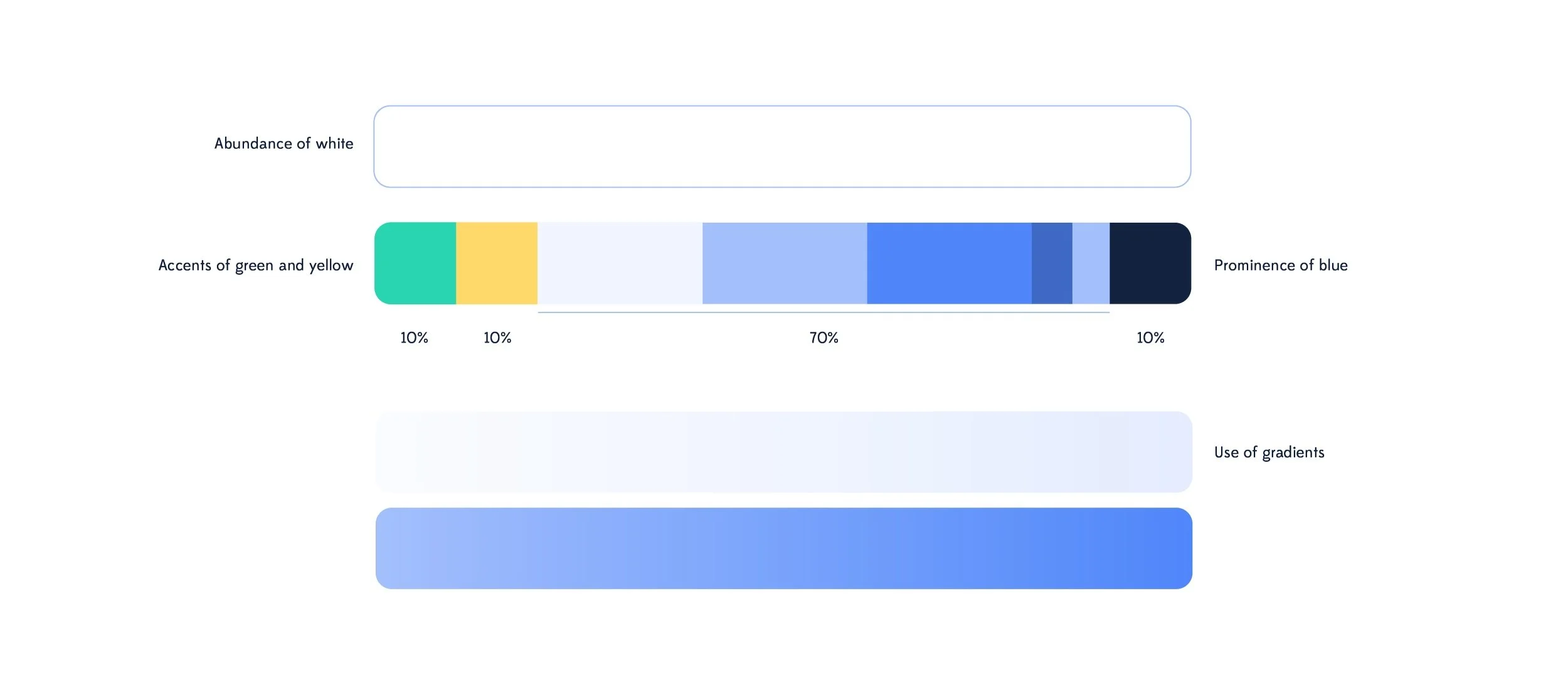
Stotles’ palette features five shades of blue, combined with accents of green and yellow. Blue is associated with trust, reliability, and professionalism. It conveys a sense of credibility, which is crucial for a tech startup to establish itself as a trustworthy and reputable brand. Navy blue adds depth and sophistication to the color palette, and evokes a sense of elegance and professionalism. Accents of green and yellow inject energy and vibrancy into the color palette. Green is associated with growth and innovation; yellow, on the other hand, represents optimism and creativity, bringing a sense of enthusiasm and positivity to the brand.
2. Colour palette
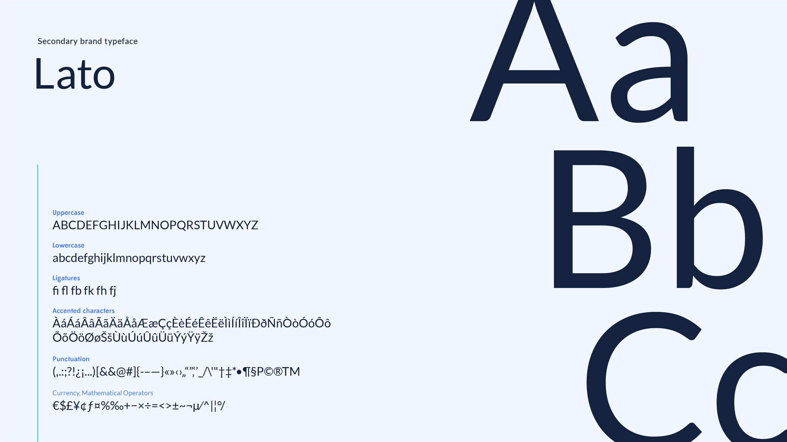
Stotles identity features the combination of two typefaces: Edmondsans and Lato.
Edmondsans explores how one optically corrects a mono-line construction to create something that looks balanced and even, when it’s actually heavily modulated.
Lato features classical proportions to give the letterforms familiar harmony and elegance, and the semi-rounded details of the letters give Lato a feeling of warmth - while the strong structure provides stability and seriousness.
EdmondSans and Lato are an excellent font combination. They offer a pleasing contrast with their distinct design characteristics, striking a balance between modern and friendly aesthetics while maintaining a cohesive and professional appearance. Both fonts ensure legibility and versatility across different mediums
3. Typography
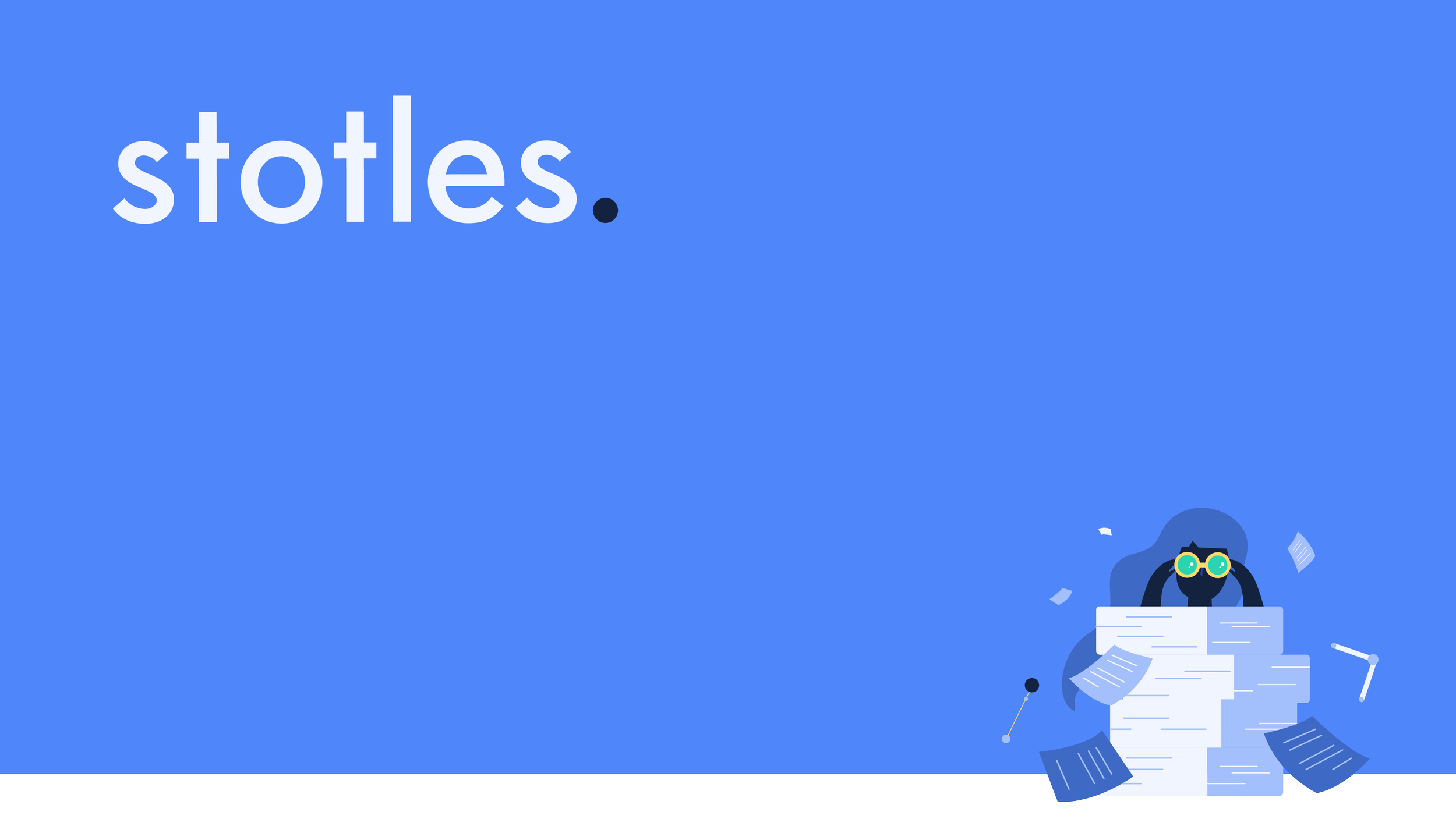
Bespoke illustrations allowed me to create a visual language that was specific to the Stotles brand, setting it apart and making the startup more memorable to potential customers. Illustrations have the ability to evoke emotions and establish a connection with the audience - They add a human touch and inject personality into the brand identity, making it more relatable and approachable.
4. Bespoke illustrations
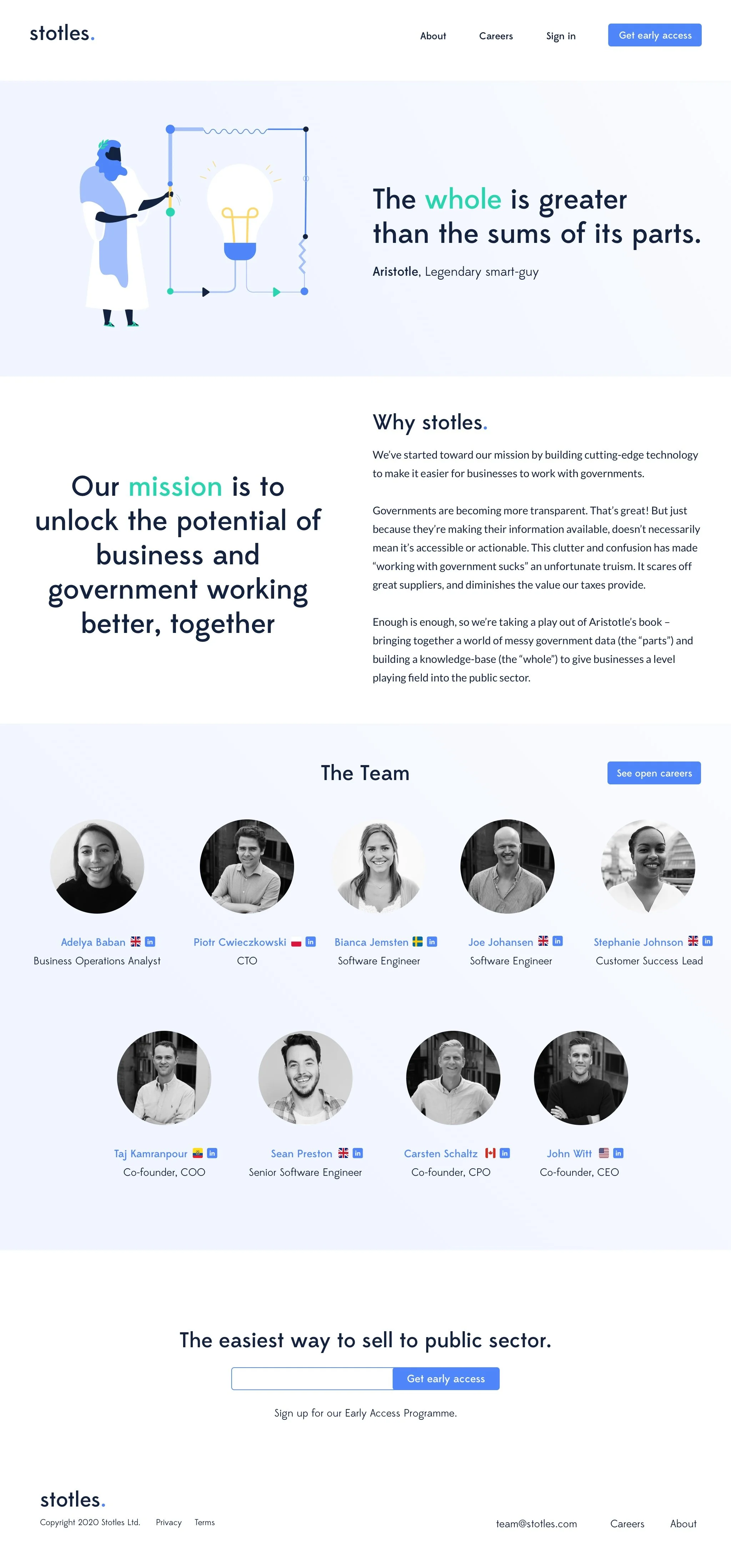
By merging functional design principles with the latest design trends, I have created a clean online experience that perfectly captures the essence of the Stotles identity.
5. Website design
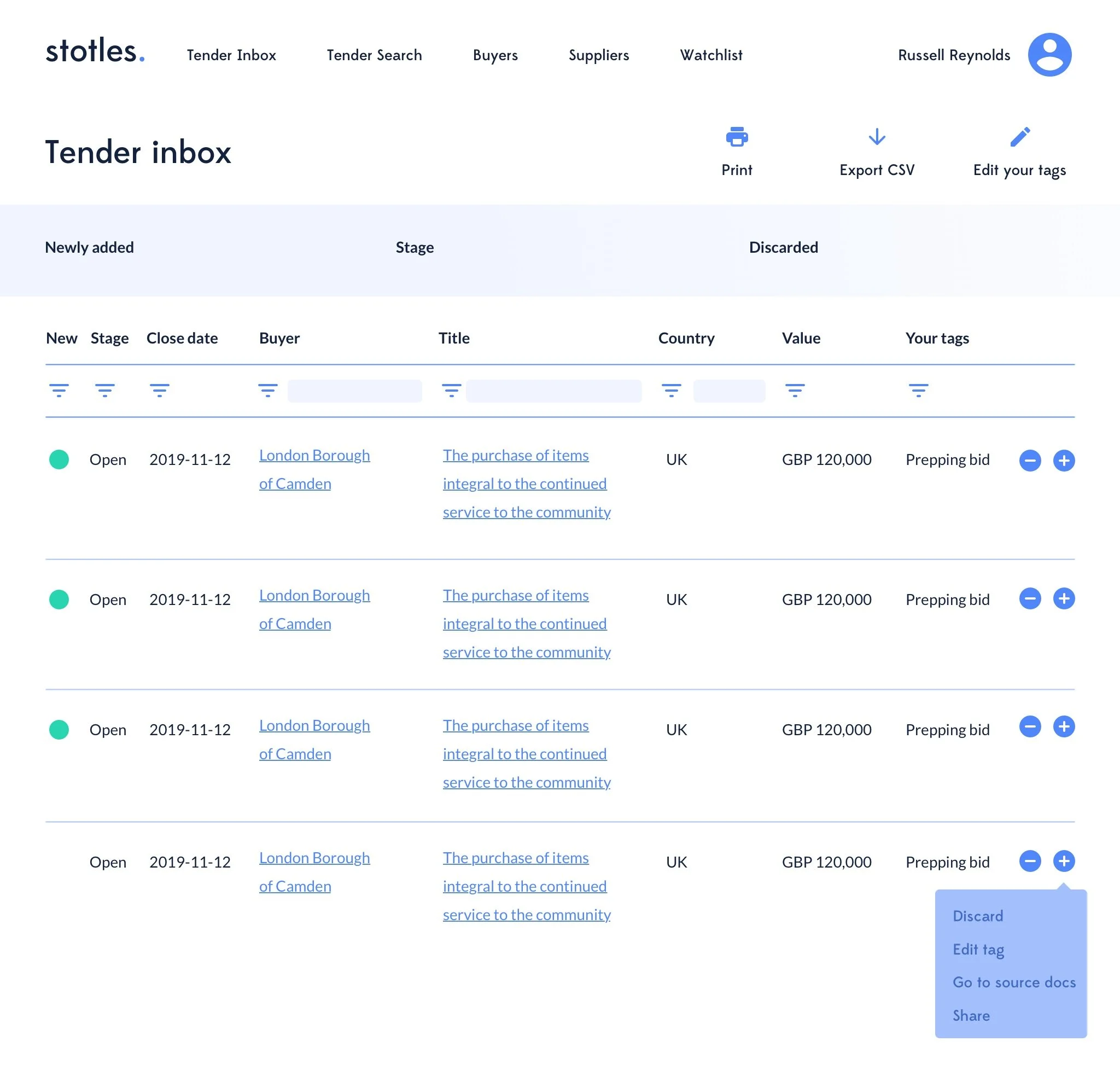
The last phase of the project was about providing the client guidance about how to use the components that define the visual aspects of a user interface . The Style Guide served as a reference for developers to ensure consistency, efficiency, and coherence in the design and software development process.

