Saberr full rebrand
Industry: SaaS, B2B
Design area: Branding identity, lllustration, Digital design
The client
Saberr helps teams work better together through research, technology and consulting. They help companies predict performance, understand relationships and provide ongoing team coaching.
The task
To create a visual style that is recognisably Saberr, can stand out from the many other workplace tools, whilst encompassing Saberr brand keywords (positive, inquisitive, trusted, intelligent, playful, inclusive). To create a consistent visual brand that scales across all areas of product and that includes: logos for the main brand and for the three core products, colour palette, choice of typography, illustrations, visual principles for all teams to be sticking to, print and digital templates for marketing materials, website design and product interface design.
Read more about the design process on the Saberr blog
1. Logos + Core motif
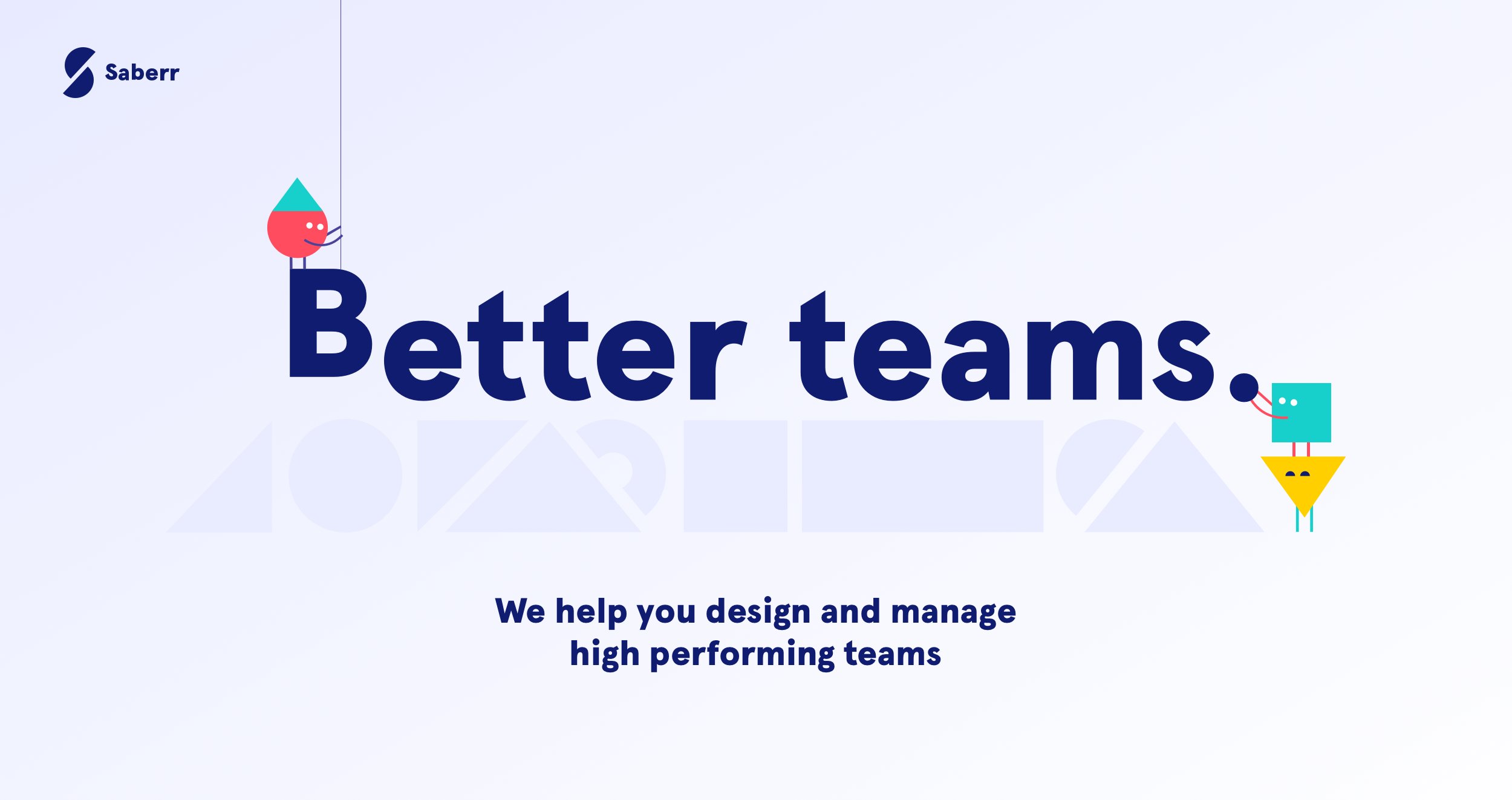
The new brand is based on the creative use geometrical shapes. These are the building blocks of the brand - I used them to create logos, illustrations and icons. It’s an adaptable motif at the core of Saberr design language and it ensures strong visual consistency.
The 4 logos - Saberr, Coachbot, Base and Coaches community - are one unique family of logos, all clearly linked together.
Every logo is formed of two parts that feel closely linked, like puzzle pieces they work together to form the whole. A subtle idea that has a teamwork undertone to it.
Using characters in illustrations is a great and inclusive way of representing teams visually in digital products. Saberr ‘old’ monsters were generally well received but didn’t reflect some of the key aspects of the brand - So I replaced the monsters and borrowed from the new recurring shape motif to build a simple set of characters working together as a team. They help reinforce the ‘positive’ and ‘playful’ nature of Saberr, but the overall mood is less childish, more abstract, and more inclusive.
The same illustration style was used to create a full set of icons.
2. Illustrations
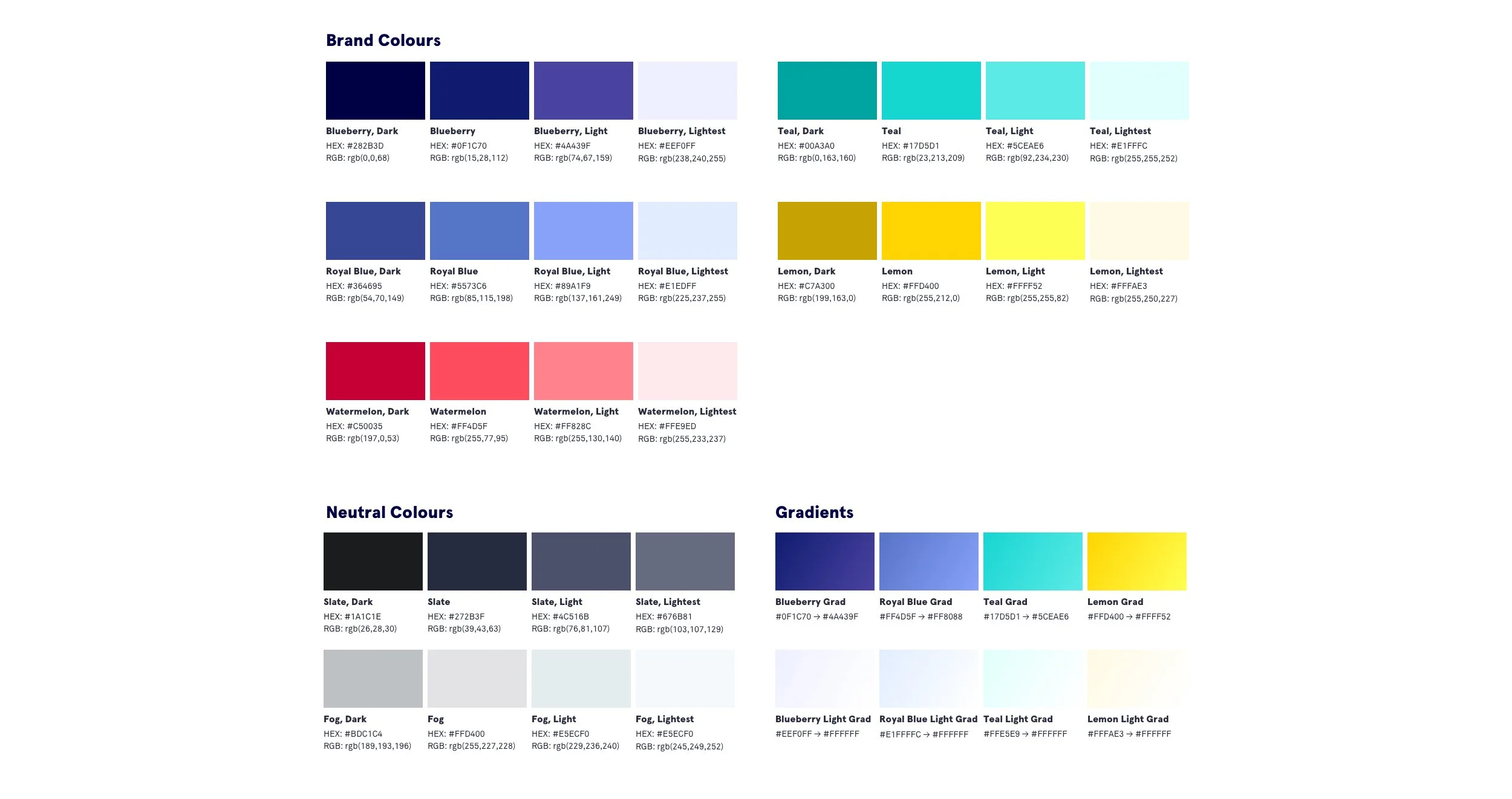
The colour palette is based around four primary colours. It’s bold but approachable, helping distinguish the brand further throughout marketing and Saberr products.
The palette was designed to be high contrast, meeting at least AA WCAG standards.
3. Colour palette
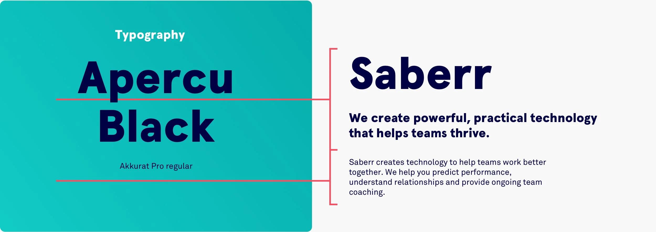
Apercu paired with Akkurat is Saberr winning combination.
Apercu is rounded, approachable, a little quirky, yet bold. Akkurat is flexible and practical -it has a slightly more formal, knowledgable tone than Apercu, whilst maintaining style and class. It also scales incredibly well maintaining great legibility from slides, down to mobile devices.
4. Typography
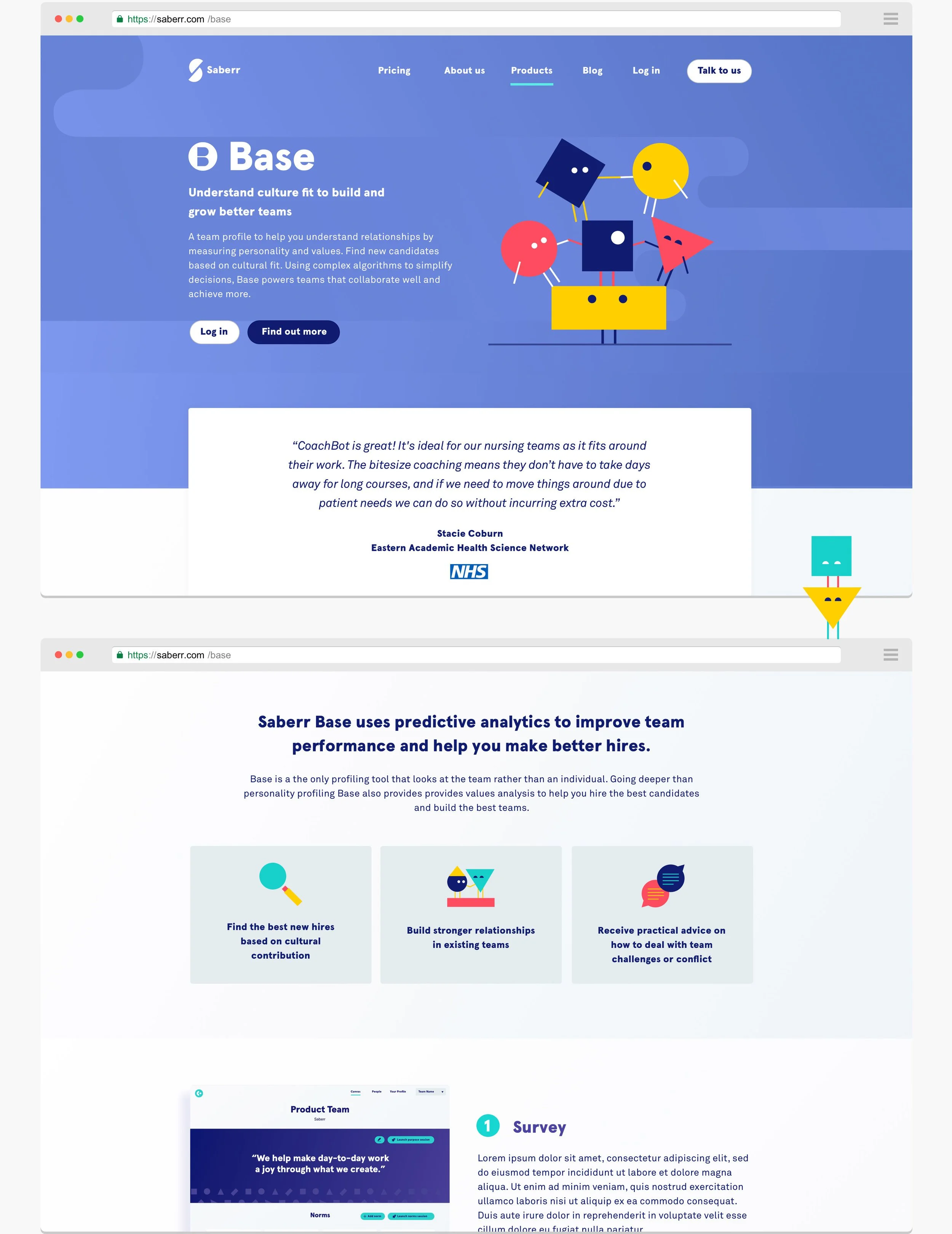
Branding elements and rules have been used to fully reskin Saberr website and products interface.
—
The website has now gone through a second redesign - New case study coming soon.
5. Website design
6. Other deliverables
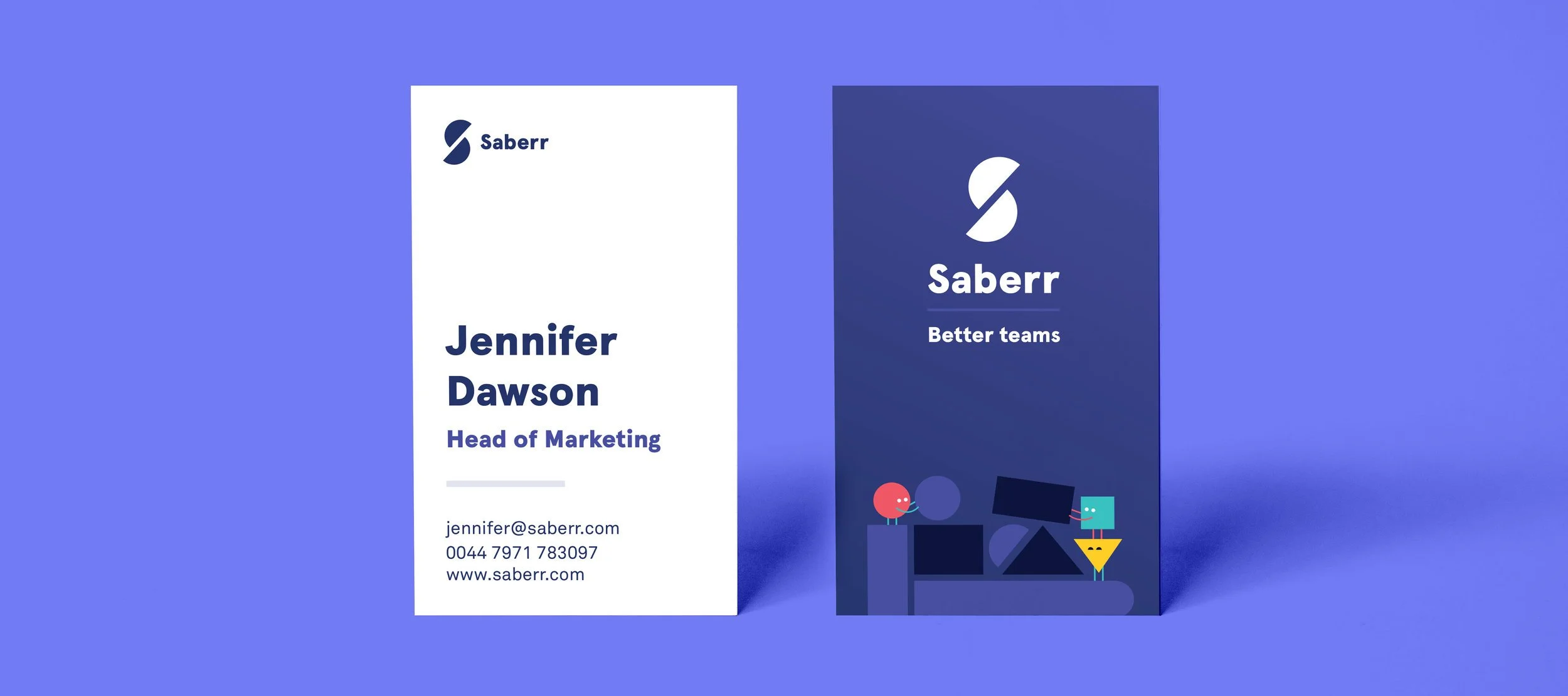
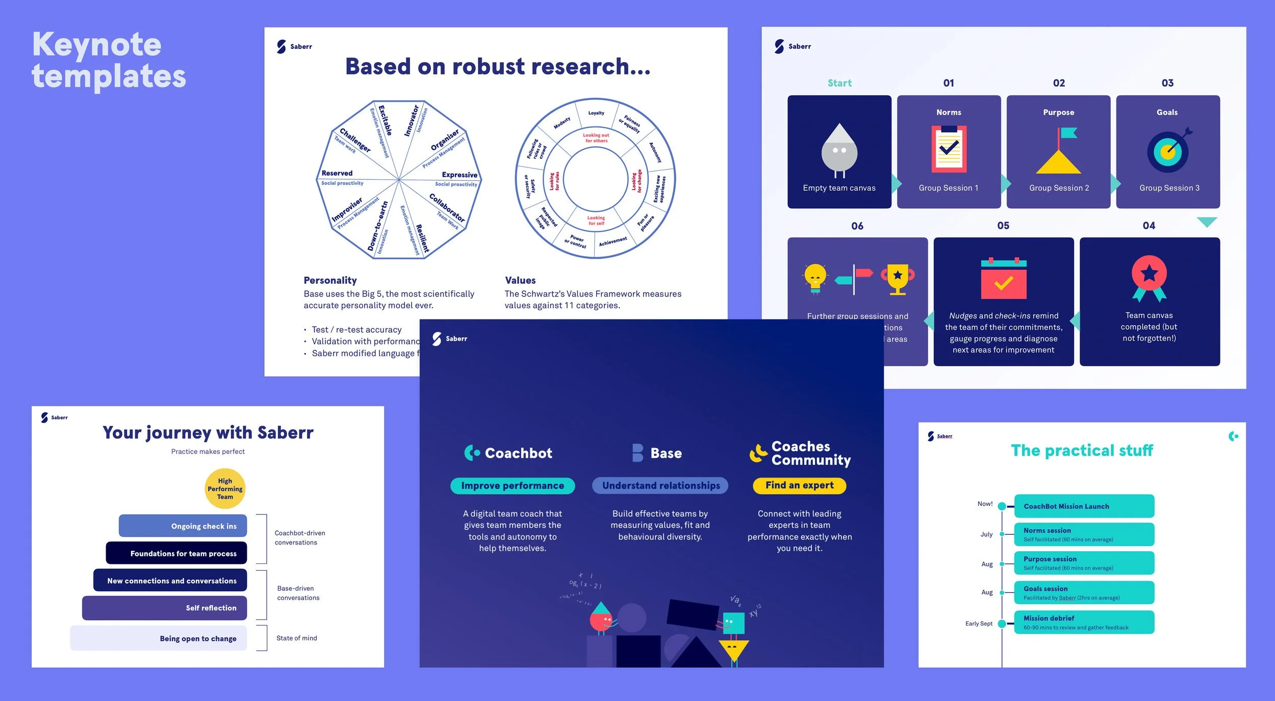
A number of deliverables were designed/re-skinned to match the new brand and reinforce Saberr presence on the market. The list of deliverables included print layouts (business cards, flyers, pull-up banners), social media assets, keynote decks, email templates, case studies docs, infographics.


