Koyo full branding
Industry: Finance
Design area: Branding identity, lllustration, Digital design
The client
Koyo Loans is a London-based tech-company providing online loans and credit cards to people with a thin credit file, which are usually either excluded from credit entirely or are treated as sub-prime and charged payday interest rates. There are over six million of these invisible customers in the UK alone.
The task
I was in charge of creating the full identity of the brand - including logo, colour palette, typography rules, graphic toolkit, patterns, social media assets, illustration style and website design.
1. Logo
The Koyo logo has a simple, friendly, and approachable style. It is set in a geometric sans-serif typeface, but it features a custom ‘K’ shape - a reminder that Koyo will always be a bit unconventional.
The logotype was tested exhaustively at various sizes and weights for maximum legibility in all the new digital contexts. The ‘K’ is a scalable mark that could convey the feeling of the full logotype in constrained spaces.

Circular is the font chosen for Koyo typography. Circular is a geometric sans serif that marries purity with warmth and strikes a balance between functionality and conceptual rigour. With both unmistakeable character and near-universal appeal, it lends itself beautifully for use in headlines or for body copy.
Just the traits we were looking for when choosing a typeface for Koyo.
2. Typography

The three colours used in this scheme tend to sit well together and are lively and harmonious. The palette offers strong visual contrast while retaining harmony and color richness. In addition, two neutral colours have been added.
3. Colour palette


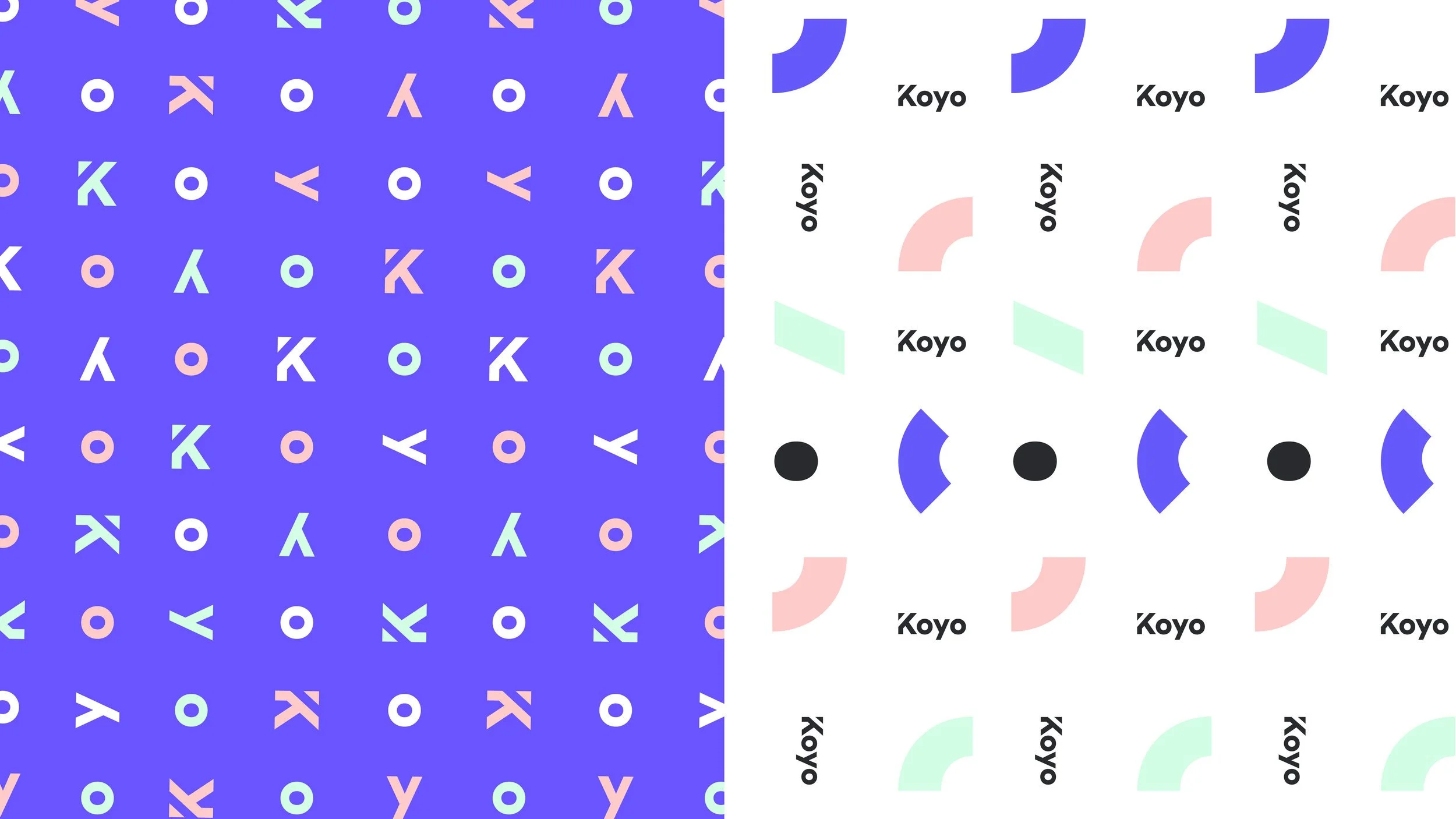
Graphic shapes are being introduced to the brand system to aid in creating compelling layouts and executions. The use of shapes in layouts is dictated by the below shapes. They can be used to create patterns and illustrations.
4. Graphic toolkit

The brand identity included a small set of bespoke illustrations, created to serve as an emotional, human connection that outweighed what other companies are doing with photography.
5. Bespoke illustrations


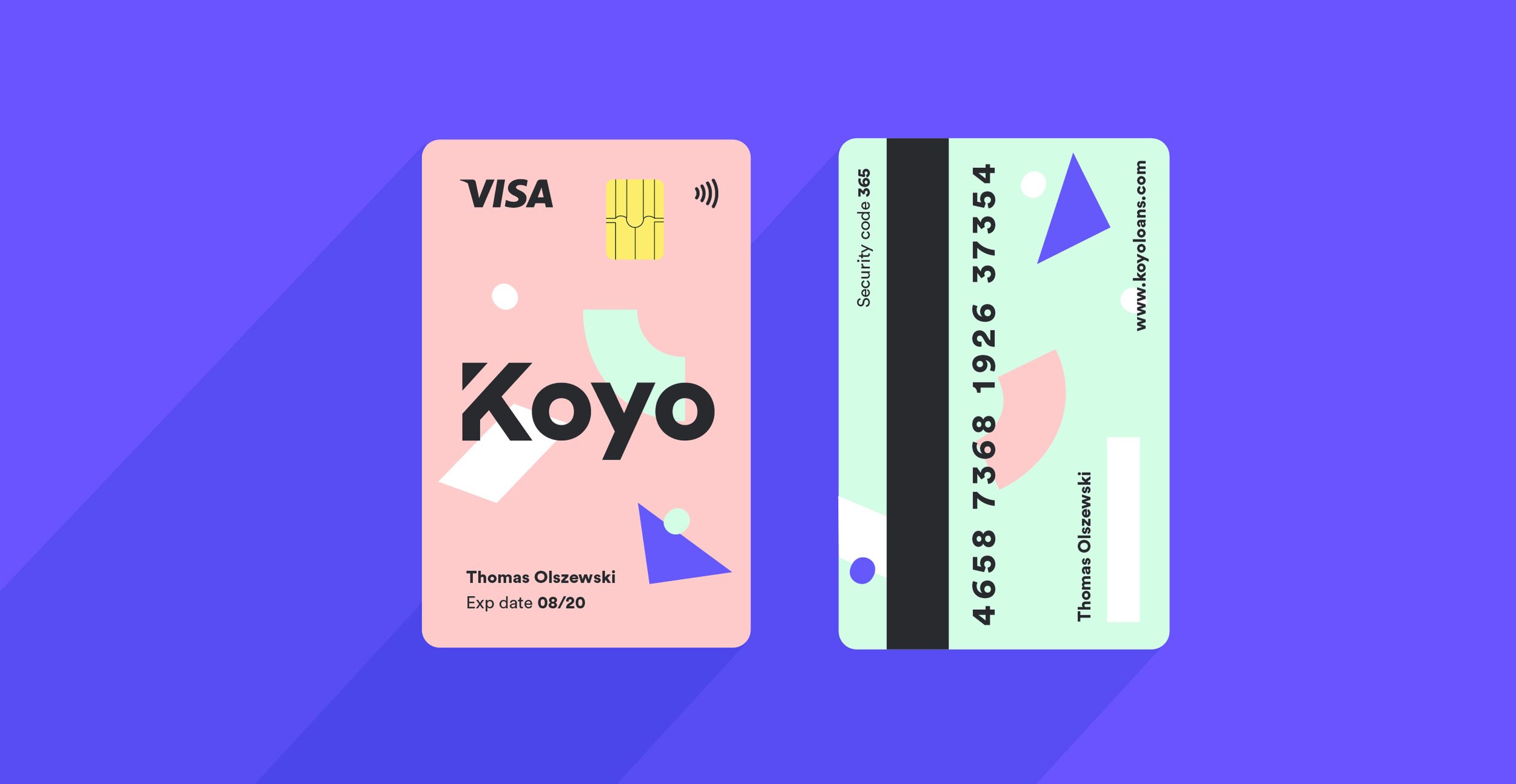
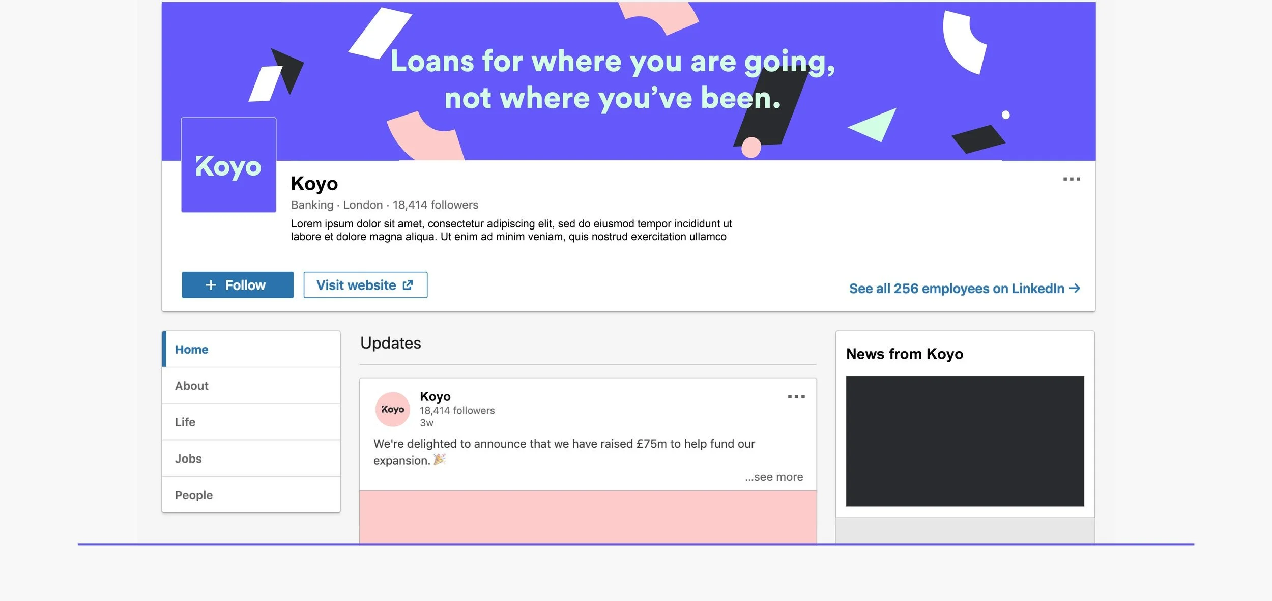
The brand elements have been tested and applied to a number of different deliverables, including a credit card design, business cards, and a set of assets ready to be used on social media
6. Brand implementation and deliverables examples


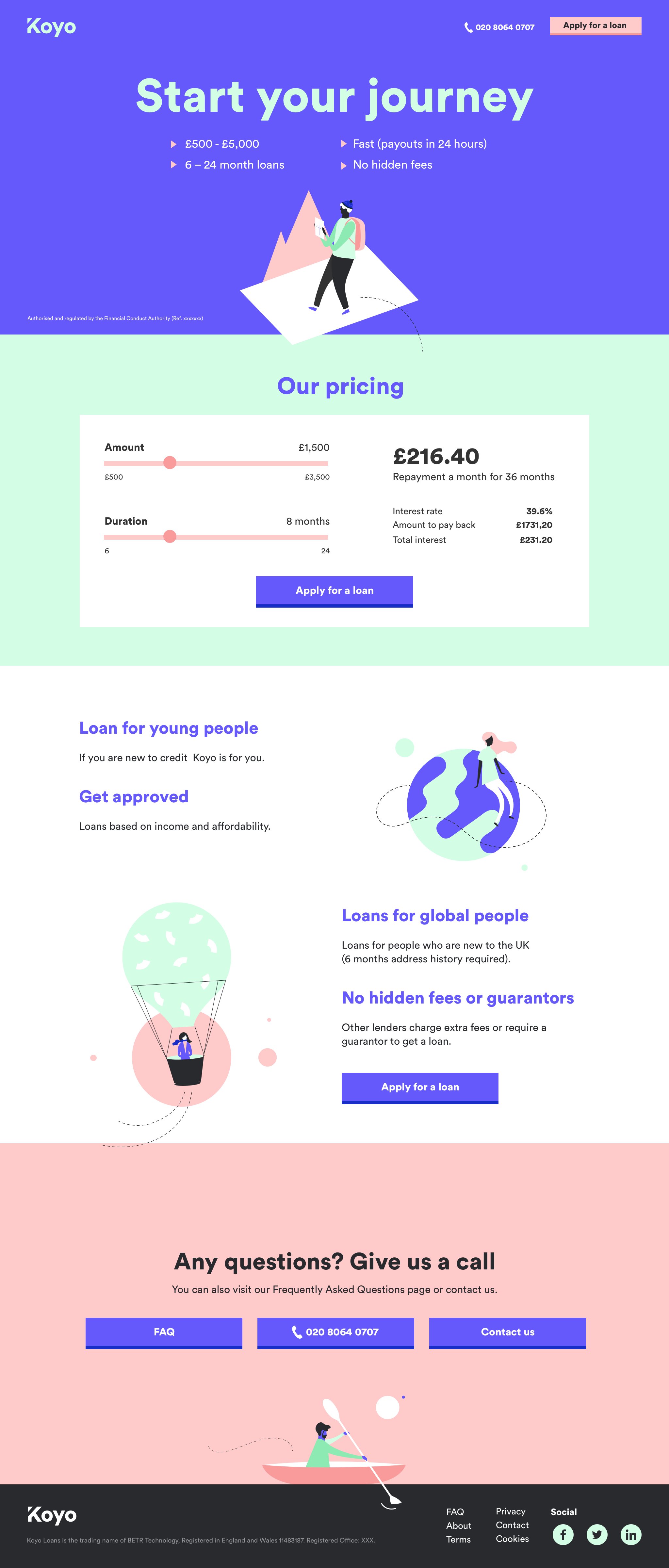
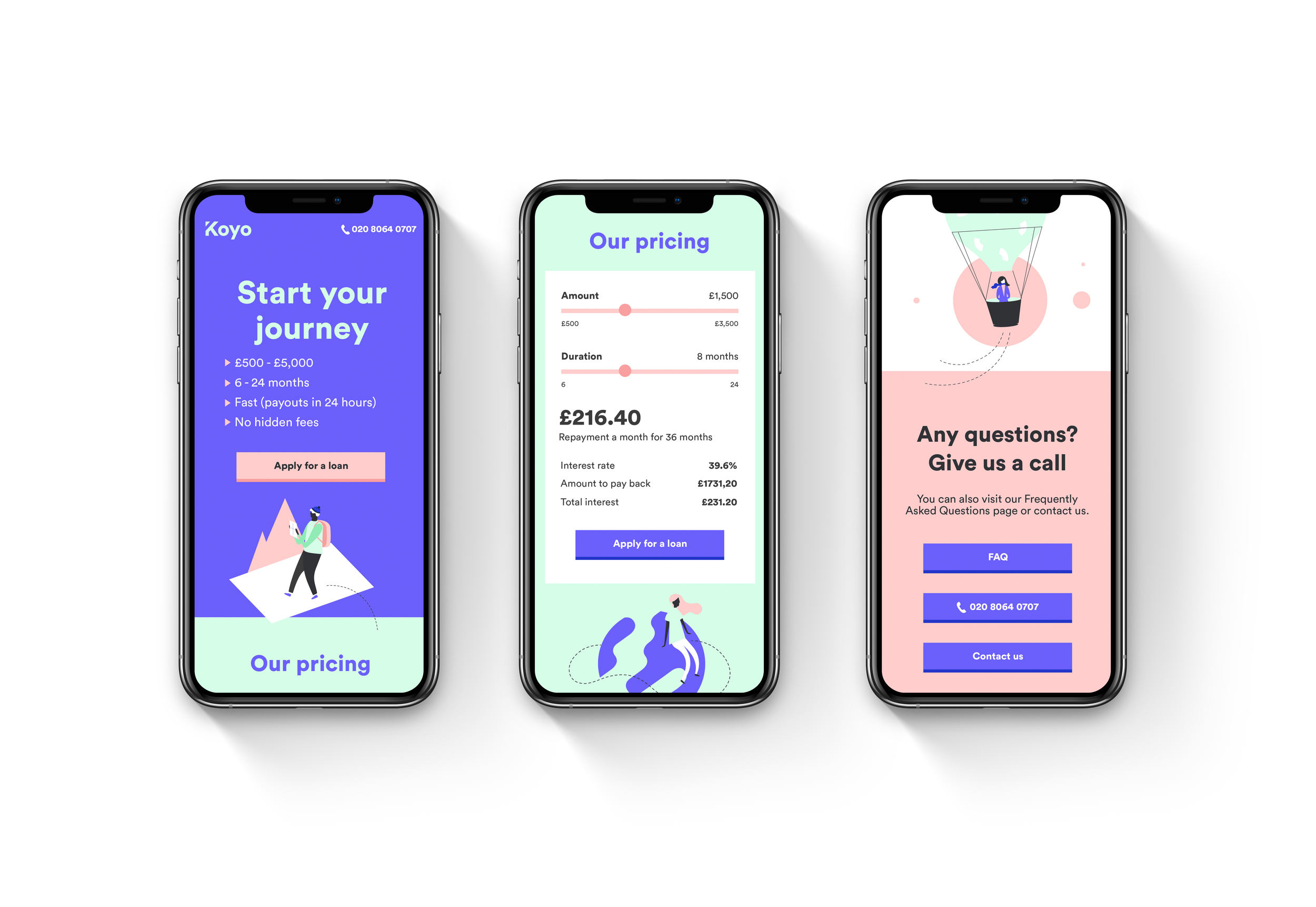
During the second phase of the project, all branding elements came together to create Koyo’s responsive website, a space where people can quickly find informations about the company and easily apply for a loan.