Utility
Warehouse
Industry: Utilities; Energy, Broadband, Mobile & Insurance
Design area: Identity creation, brand roll out, event development and BAU comms
The client
Utility Warehouse is an award-winning FTSE 250 home services company and the only company in the UK that bundles; energy, broadband, mobile and home insurance. Based in London, UW has nationwide reach and has recently surpassed the 1 million customer mark.
The task
In 2020, for the first time since the business was founded in 2002, UW underwent a wholesale rebrand. I was part of the amazing in-house design team that developed and brought to life the new identity. As part of that work I helped establish brand guidelines, documenting all rules on Frontify, along with creating an online Frontify database of all the templates and brand assets. Since 2020, I have been collaborating with the in-house team on a regular basis, implementing, stress testing and evolving the new brand on a broad range of different comms, including but not limited to; social templates, reports, digital comms, presentations, event branding, newsletters and internal comms.
—
Design director: Kirk Watson
Design team: Rossana Piazzini, Caitlin Burr, Nathan Wilkinson, Cleo Georgiou

One line
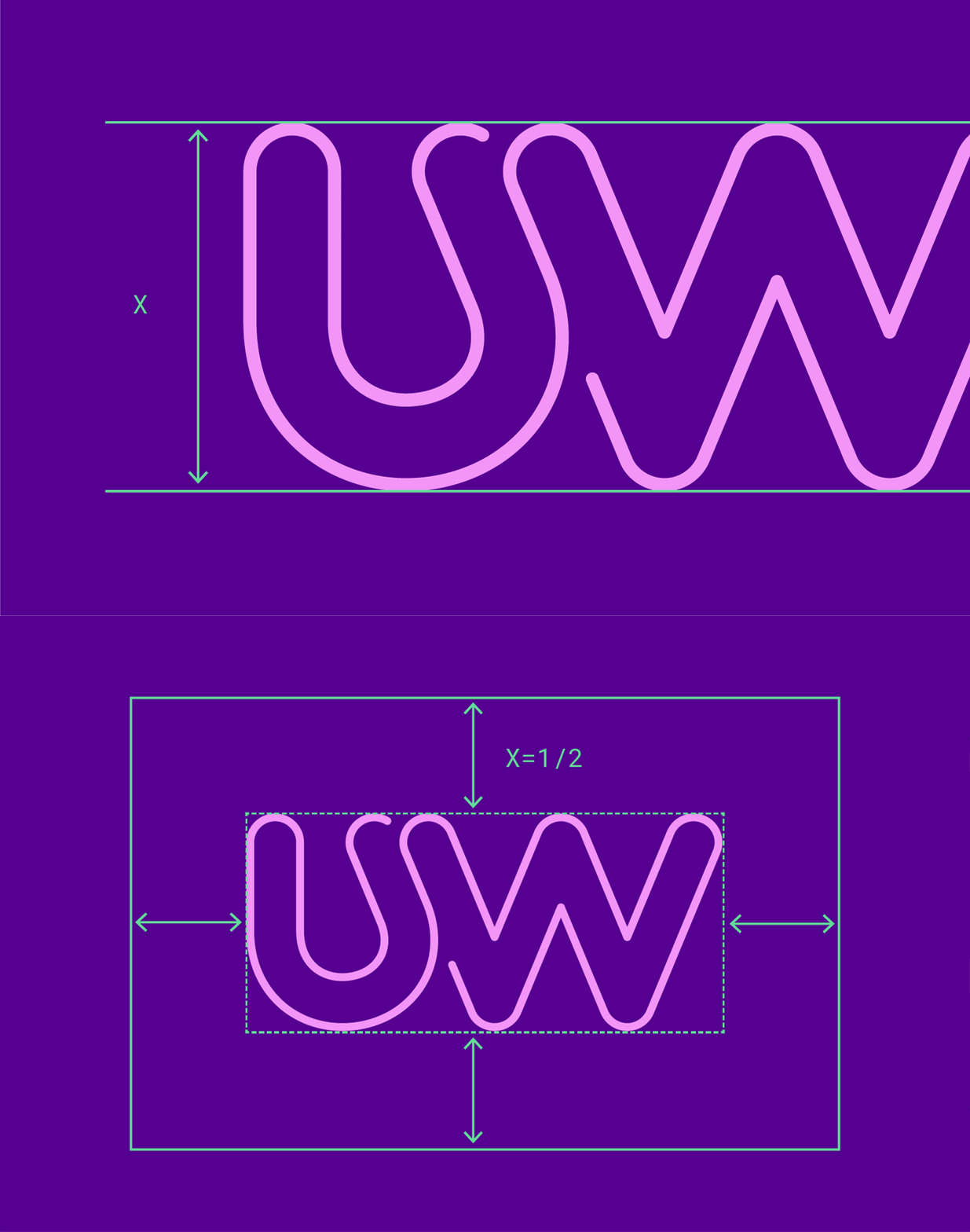
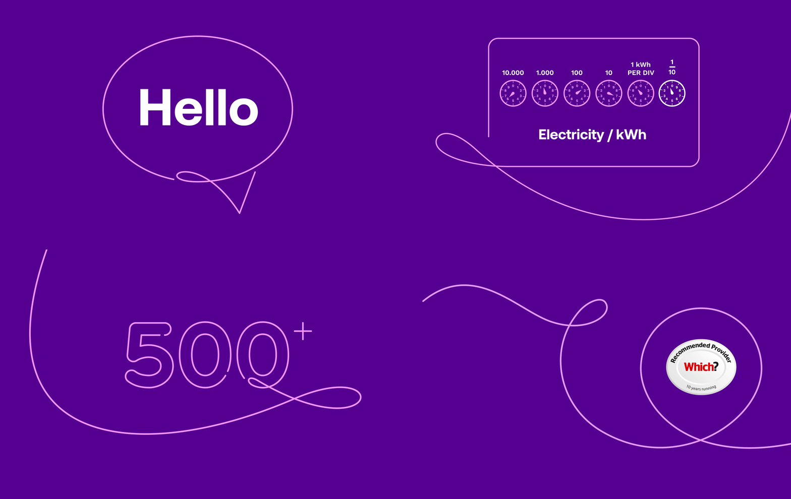
The UW visual identity system is born out of a single pink line. A single line with a myriad of different applications from the hyper functional to the purely decorative. The concept behind the line is simplicity; a graphic representation of the straightforward, single mindedness of the UW offering. The UW monogram is an iconic and succinct articulation of this design concept.
Purple is UW's hero colour. We wanted it to be both ownable and instantly recognisable as Utility Warehouse. Purple is supported by a secondary colour palette that allows flexibility while maintaining consistency across all touchpoints.
Owning purple
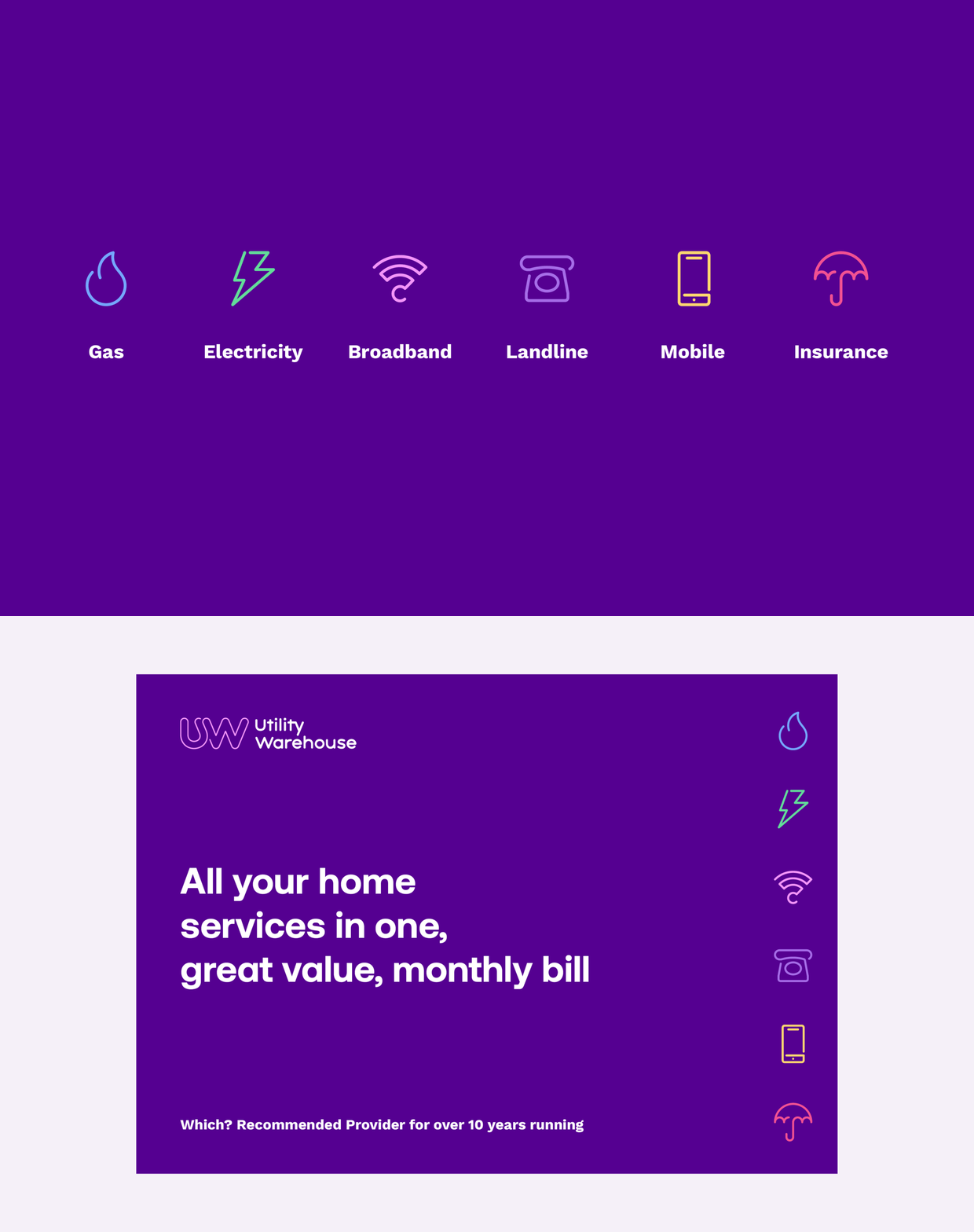
Simplicity is at the core of the UW iconography suite. When we create a UW icon we ask — what are the minimum amount of strokes we can use to illustrate a concept, while still retaining the clarity of what we're communicating.
Iconography
Typography
We chose to use the combination of Aeonik and Work Sans. Aeonik has a modern, sleek and sophisticated look with its clean lines and geometric shapes, while Work Sans has a more friendly and approachable feel with its rounded forms and, with its open counters and generous x-height, enhances readability, making it suitable for body copy or smaller sizes. Both fonts are highly versatile and can flex across print and digital media.
These are hero illustrations that centre around people, be that UW Partners, customers or staff. The illustrations have been created to bring to life different aspects of the business, as well as contextualise how customers, distributors and staff engage with UW, whether thats using its products or simply getting on in life. Please see full case study here.
Illustrations
We applied the UW brand identity to multiple touchpoints, ensuring consistency and coherence across various channels and platforms. By creating a unified identity across all touchpoints we were able to build equity in the brand across multiple audiences and develop a solid foundation for further development, refinement and evolution.
Applications
UW offers an extensive diary of live events for its partners. These include career opportunity presentations and buzz events, kick-off seminars, plus large corporate events each year (Amplify and Power UP). For each event, we created a sub-brand identity and a vast set of mixed-media deliverables.


